Or, you know, do both
I recently did a user research interview for DevBoost, a local software house. They’re gathering some input from people who have been in the Product Owner role. Though I’ve never officially had the title, I have been in the role, JIRA / Github tickets and all. In the interview, they asked me about tools I use. I talked a bit about visualising. Then they asked me when I started drawing diagrams for strategic visions, as apparently their other interviewees hadn’t mentioned visualisation tooling as a must-have.
I’ve been drawing diagrams for a very long time. I map things out for several reasons, but the biggest is because it’s easier for me to get big complex ideas out of my head. It’s a cognitive processing thing, but over the years I’ve noticed that this habit doesn’t just benefit me personally.
We all have different ways of understanding information. Visualising things, in addition to writing about them, helps more people process the ideas. Diagrams support neurodiversity and can help us engage and communicate with one another. Multiple modes of conveying information mean that people understand strategies or ideas more accurately. They have cross reference points to verify if they’re understanding something correctly. Diagrams are tools to help us understand and explain complex systems.
This post covers some ways to use visualisation as well as some tools and methodologies for knowledge production (e.g. thinking and documenting it!).
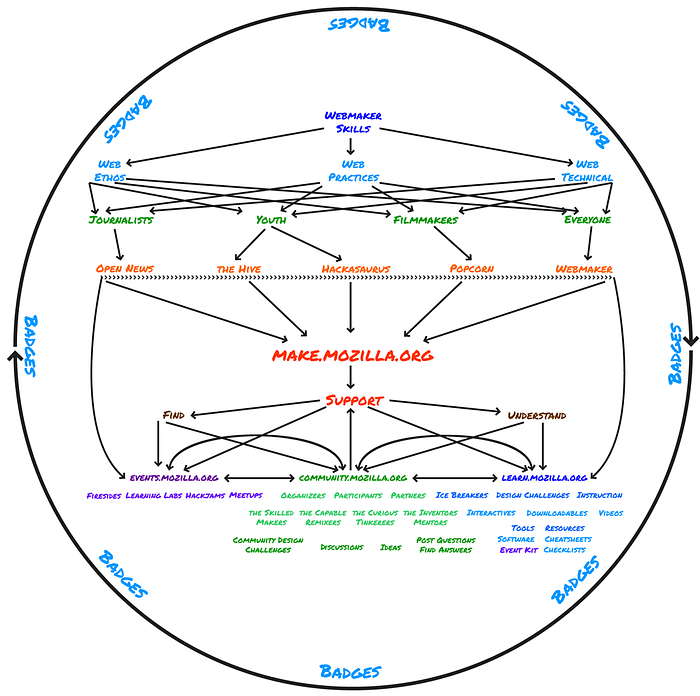
Summarise your Digital Strategy

A digital strategy can be a complex document with lots of ins and outs. Creating an overview graphic of a digital strategy can help you see all the different pieces quickly. We can always use a document to flesh out strategic initiatives and interaction points. Showing how digital products and communities overlap and interact with one another in a diagram helps people “get it” quite quickly.
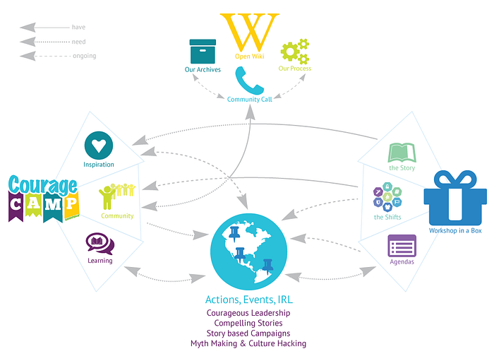
Visualise Pathways

Learning pathways are a common tool in educational circles to help learners understand what various prerequisites or goals might be. In open source projects, we often use contributor pathways to help projects understand where and how their community accesses information. This allows us to see pain points and places where process is required. Visualising how people “move” about in a programme or project is helpful both for the people doing the moving and the people designing the systems within which people move.
Explain Concepts
You don’t have to be a professional designer to make helpful diagrams! Sometimes a quick mockup is exactly what you need to explain a tricky concept. You can preface things with “This isn’t a wireframe but…” and then use wire framing to explain an idea. Or you can visualise an entire landscape (with your unique art skills ?) and use it to explain where you want to be in five years.
Tools for thinking and mapping
The diagram is something that comes after the heavy lifting of the thinking. There’s loads of methodologies for thinking that can help you figure out what’s in your (and your team’s!) head(s). Here are three of my go-to places:
Choosing tools is a personal endeavour. I recommend that you try different tools out and see what works for you. FWIW a piece of paper and a nice pen can save you from loads of tool-related frustration! If you can draw what you’re trying to diagram, half the work is done. The hard part is the thinking.
But back to software. Back in the day I used Adobe software, usually Illustrator, because I used to teach Adobe employees how to use Adobe products. I had the full suite for free. Nowadays I use a variety of software tools some I (or the co-op) pays for, some I use free versions of. Most often I use Whimsical, Google Slide drawing tools or Sketch, but sometimes you need a Mural, Miro or even a Jamboard. I choose my tools contextually, so it depends on what kind of diagram I’m making.
How and when do you use visualisation? For what?