One of the challenges for the future look and feel of Greenpeace websites is the need for a new colour story. As a global organisation, Greenpeace needs a strategy around colour that moves away from the classic, standard colour palette to a more global set of colours which more accurately reflects the organisation today.
Historical and Traditional Colours in the new palette
The Greenpeace green (#66cc00 ) will now only be used in the logo. By enforcing this rule and using it for this sole purpose, the Greenpeace green will become synonymous with the logo. Please note the only other colour to be used with the logo is white.
We have made a set of four ‘shade’ colours to sit alongside Greenpeace green, to be used for other “Green needs”.
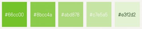
These tonalities of green will have to be used for areas of the website where we talk about ourselves, where we explain how Greenpeace operates, including our financial and legal structures or our history.
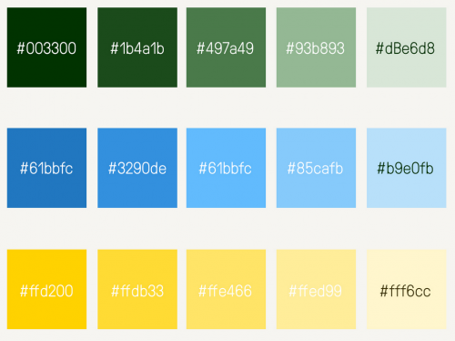
Together with the Greenpeace “Green set”, Planet 4 will introduce three new sets of ‘historical colours’. These tonalities are based on existing palettes created by Greenpeace Nordic and Greenpeace Germany. We call these ‘The Traditional Colour Palette‘, and its scope is to ensure brand harmony with existing offline engagement.
Expanding the Planet 4 palettes for the new web
A little over a month ago, the Planet 4 project team asked for help and inspiration for our design team. We asked people across Greenpeace (and, indeed, the world) to make a “style tile”, a design asset used to show a summary of various elements. Those who participated showed us that people in the Greenpeace community are eager for a more dynamic palette.
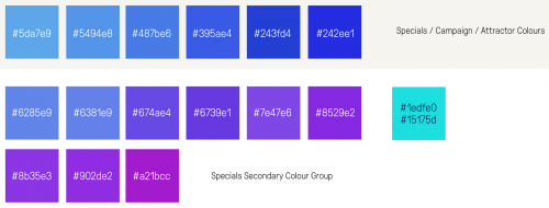
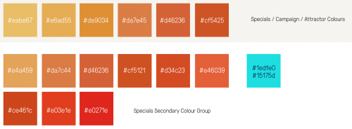
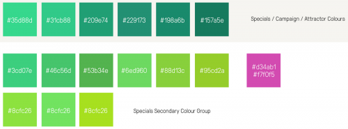
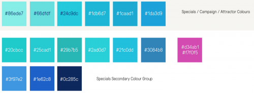
To accompany our more traditional colour palette, we’ve responded to this community insight and created the ‘Future Colour Palette‘, to be used to breath dynamic light into content. It is an engagement colour set, which will help us to draw even more attention to content that includes a call to action.
The ‘Future Colour Palette’ integrates with the ‘The Traditional Colour Palette’, adding four new colour sets each composed each with six shade colours of a lead colour. 36 secondary/highlight colours will also be available to allow for more versatile communications, to be used, for example, to highlight issues and in conjunction with the main colour sets.
Using these palettes
As we continue to shape Planet 4, we’ll be pulling together samples and examples, “DOs & DON’Ts” to help editors use these palettes effectively. Since we are no longer assigning colours in our digital spaces, we hope that campaigns and projects across Greenpeace will draw from these wide reaching color palettes and help Planet 4 achieve visual consistency in all of our communications.
A very special thank you to Will Morris-Julien for doing the hard colour work and providing the notes for this post.